
WooMeNow Experience Viewing Concept
Web application that offers curated dating experiences to inspire and encourage couples, families and friends to maintain healthy relationships.
FREELANCEUIUX
WOOMENOW PROJECT OVERVIEW
Project Summary
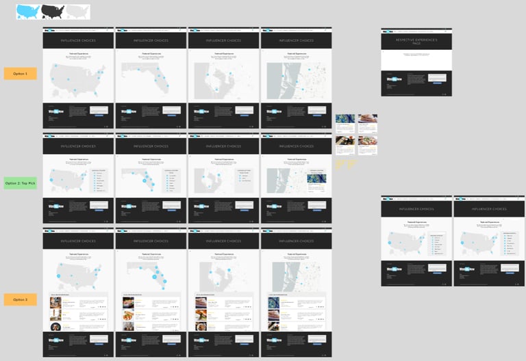
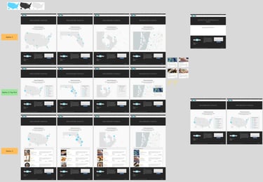
The CEO of WooMeNow approached me about creating new functionality that would allow his customers easier access to view the available date night excursions. The original design was a simple product view with cards to show each excursion option. You could click on a “city” card to view the excursions in each city, however, you would have to go to a separate page for each city.
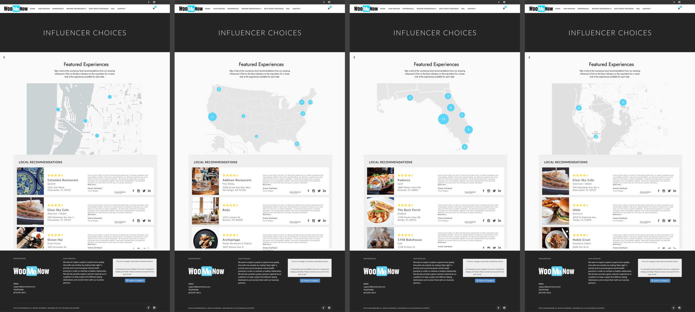
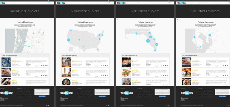
In the future, he plans to expand to several major cities, so keeping that in mind, the current design wouldn’t be scalable. He needed a new method for his customers to view each date night excursion all in one place. In the end, a map function was designed that allowed him to create “excursion points” shown on a map you could use the filter options to narrow down possibilities and click “into” points to further zoom into an area with multiple excursions. Similar to how Google map operates, this function would show the details of the excursion once clicked on and provide a booking button to allow a quick “one-stop-shop” for all available date night experiences.
The Challenge:
Specific problem: Need a more intuitive way to view experiences available in each location.
User Needs:
See excursions in one place
The location should be the main filter
Fewer clicks (the current system is too “labor intensive”
Should be scalable for future additions (both city-wise and experience-wise)
Business Requirements:
Create one place for all excursions to be shown so CEO can send people to one page to view all available experiences
Promotional point for getting stakeholders on board and more businesses who want more exposure through this program
Easy enough to add experiences that CEO can do himself
Pain Points:
Not scalable
Current system is too clunky and labor-intensive
Adding experiences takes too much time
Technical Constraints:
Limited by free plugins (or cheap) provided from WordPress
Might end up being a custom script injection (might need someone more familiar with building components like that that require a database to house the experiences)
KPIs to Keep in Mind:
Overall site visits
Page retention
Number of orders
Average usage time
Project Details
Timeline: Nov 2021 - Jan 2022
Project Type: Freelance Project
Role: UI/UX Designer
Tools/Software Used:
WordPress
Adobe Photoshop
Google Docs/ Google Drive
Paper and Pencil
Figma
Miro
Goal:
Create a new method to view date night experiences in each city.


Target Users
Customers looking for a unique date night experience
Easy way to view date night experiences available (all in one page)
Quick access to buy experiences and quick checkout
Companies wanting their business to gain more promotion
Need the ability to add deals to their own business experience listing
Solution
Ran a competitive analysis to determine successful event platforms (ticket companies such as ticket master and map platforms like WAZE and google maps). Since we wanted to simplify the experience and keep it all on one page rather than sending the user off to different “region-based” pages to view the experiences available, the design focused on how to bring all the experiences to one page of the website.
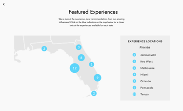
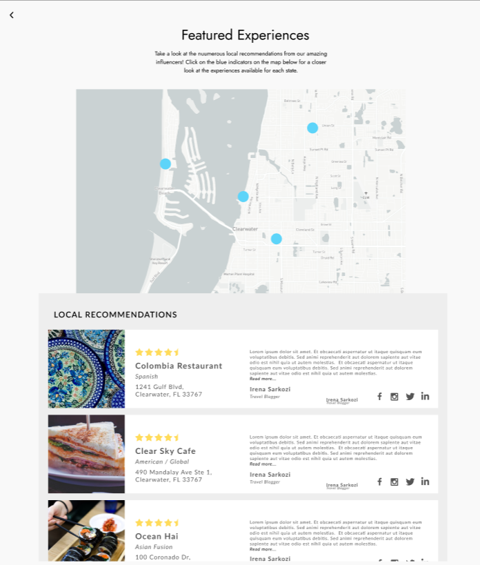
Also having location as the primary filter helped to narrow down that the design should be focused around a map feature to view where the experiences are happening around the world. You could then zoom into each region to view the specific experiences available.
This design removed the need for unnecessary clicks from going around the site trying to find what’s available in each region and instead has all of your options collected under the map for ease of viewing. You could also click on each point on the map to view a “quick summary”, that, if you clicked on, could take you to the individual experience’s page to view all information pertaining to the experience. This also made it scalable for any future additional experiences.
As for how these features address the goals, it collapsed available options into one page so it became one page for the owner to send clients/customers to view available experiences. They also made it simpler for businesses to be found in each location, thereby reducing the effort required by the user significantly. Since there wasn’t a breadcrumb trail before remember what you’ve seen and haven’t seen was a hassle. Now with the map view, they could check a specific area(s) and view all hits in the list below the map.
WOOMENOW FINAL OUTCOMES
Results
Project Success Metrics
Since this was just rolled out as a future concept, no success metrics were captured.
Reflections
More research would have been a good idea, but with the owner's limited time range for this concept and it just being an idea for the future, the research could be done at a later date should he so choose. Looking back, I would have also prioritized the layout of the individual business listing a bit more, it was a bit rushed and I would have liked to spend more time determining what info should have been shown/left out on the quick summary vs the actual in depth listing/page for the experience
Next Steps
Should the owner reach back out about continuing to implement the function, we can discuss how best to break down the task to accomplish it within a reasonable timeline.
Let's Connect!
Something catch your eye and want to reach out for a chat? Whether you have questions, a project to do, or just want to say hi, feel free to connect with me and we can get started!