
Great Leaps (Dashboard)
Dashboard for educational administrators, tutors, and parents in order to better organize data and view student progress from individual students to entire districts.
UIUXWORKBIGDATA
Due to a non-disclosure agreement, information on this project is limited.
GREAT LEAPS PROJECT OVERVIEW
Project Summary
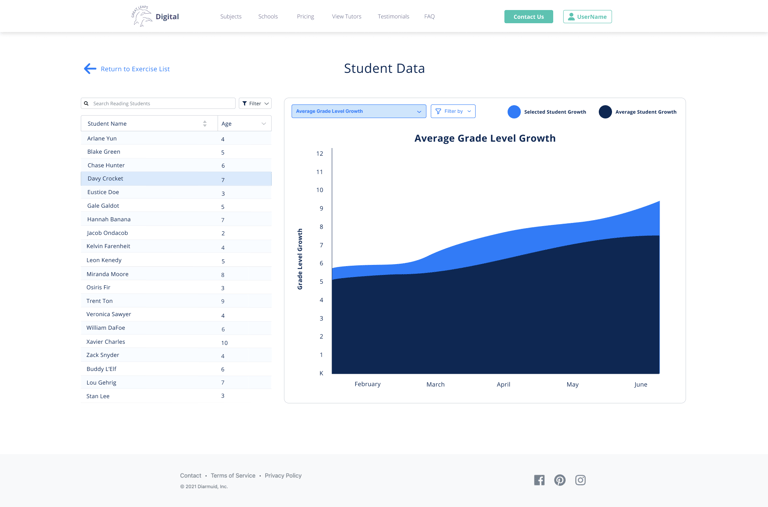
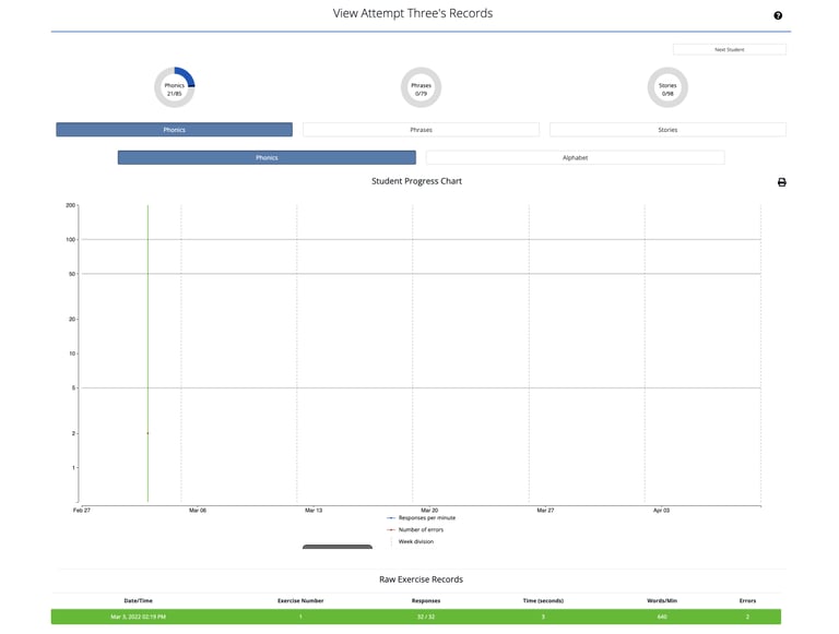
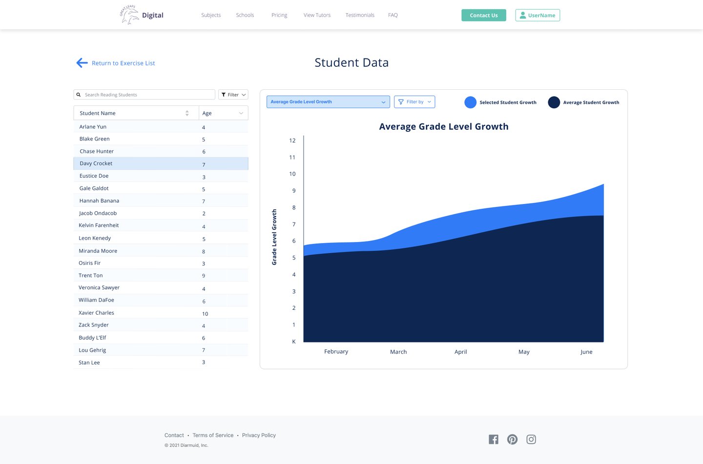
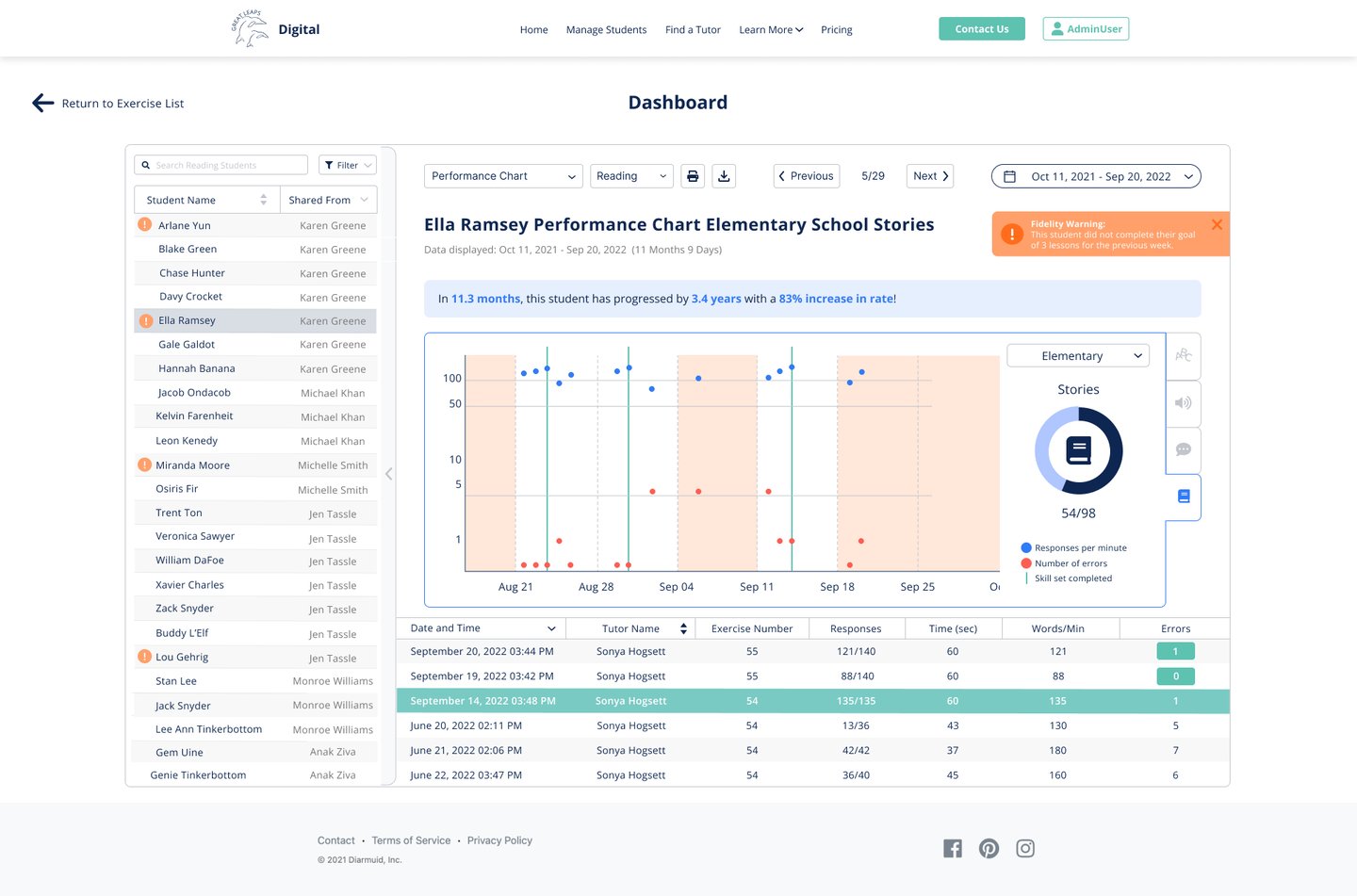
The CEO wanted to incorporate a method for teachers and school/district admin to view student progress more easily. This included viewing individual student progress in comparison to class averages in the following areas: progress in specific markers, average changes in reading rate, grade level growth, and demographic information. The statistics page was added at a later date (Starting March - June 2023). It was also designed so you could manipulate the time period of the data being shown in case teachers or admin wanted to view a specific period for progress.
The Challenge:
There was no intuitive way on the site to view student progress. The only measure of student progress available at the time was a records page which only tracked how many goals a student completed during their tutoring sessions. They wanted to improve their progress tracking with the addition of grade level growth, change in reading rate, and demographics. In doing so, they hoped to stand above what competitors offered and provide a unique experience centrally focused on the student's improvement.
User Needs:
Need to view individual progress data in comparison to overall class and district average data
Needs to be scalable for a potentially substantial amount of children in a roster
Needs to account for fidelity tracking if the student is completing sessions as expected and then correlating it to progress indicators
Needs to show raw data since the student began the program to present
Needs to include records data (donuts)
Show student progress data, grade level growth, changes in reading rate, and demographic data for individual students and whole class / district averages (statistics page added during phase 2)
Business Requirements:
Make it intuitive and simple to quickly glance and find the information needed.
Must protect student data if used for demonstration purposes
Ability to quickly flip between students to quickly view each
Ability to manipulate date range while looking at data shown
Pain Points:
No progress viewing system was in place at the time
Too much effort is required to choose a student, click in to view records info, then return and have to scroll to find the next student to view.
Technical Constraints:
Our team consists of 2 developers (one front end and one backend) and myself as the acting UI/UX Designer and researcher. The time scope for a project of this scope was quite long compared to usual projects, including testing time.
Have to make sure dashboard placement of controls is intuitive enough for a wide range of age groups (18-80+yrs old)
Looking to build using React, but in doing so, we would want to move the rest of the site over to React as well to keep everything consistent (requiring much more time)
Keep load times optimized with the expected large amount of student data it needs to parse through (keep SQL queries limited as much as possible)
Keep in mind how to handle children with the same name, and families with multiple children assigned under one account
KPIs to Keep in Mind:
Decreased bounce rate
Increased page usage/ retention rate
Increase in school districts interested in integrating programs into their own districts (quantifiable during conferences in which CEO frequently promotes program)


Project Details
Timeline: Sep 2019 - Dec 2019 / Phase 2: Addition of Statistics page, Mar 2023 - June 2023
Project Type: Work Project
Role: Lead UI/UX Designer and Researcher
Tools/Software Used:
Figma
Adobe Photoshop
Adobe Illustrator
Google Analytics
Microsoft PowerPoint and Word
Google Forms (for remote surveys)
Shopify
Goal:
Design a central hub to track student progress both at the individual and class levels for use by tutors, teachers, parents, and administrators.
How it started:
First Attempts:
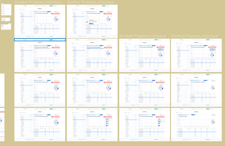
A Few of the Many Other Attempts:
Target Users
Teacher/ Tutor
Track individual student and class progress for student progress, change in reading rate, grade level growth (and later statistics)
Quick overview and intuitive user flow needed since teachers/tutors' age ranges and familiarity with technology varies from 18-80+
Administration
Track individual student progress as well as whole classes, schools, and districts
Scalability must be important here
Need printing and downloading functions available for them to print and distribute progress for school boards
Quick overview and intuitive user flow are needed since administration age ranges and familiarity with technology varies from 18-80+
Parents (later down the road)
Easily view relevant info to their child about their student’s progress, change in reading rate, and grade level growth
Need a quick summary to show progress and point out problems to address without technical/educational-specific jargon
Solution

Ran a competitive analysis to determine successful event platforms (ticket companies such as ticket master and map platforms like WAZE and google maps). Since we wanted to simplify the experience and keep it all on one page rather than sending the user off to different “region-based” pages to view the experiences available, the design focused on how to bring all the experiences to one page of the website.
Also having location as the primary filter helped to narrow down that the design should be focused around a map feature to view where the experiences are happening around the world. You could then zoom into each region to view the specific experiences available.
This design removed the need for unnecessary clicks from going around the site trying to find what’s available in each region and instead has all of your options collected under the map for ease of viewing. You could also click on each point on the map to view a “quick summary”, that, if you clicked on, could take you to the individual experience’s page to view all information pertaining to the experience. This also made it scalable for any future additional experiences.
As for how these features address the goals, it collapsed available options into one page so it became one page for the owner to send clients/customers to view available experiences. They also made it simpler for businesses to be found in each location, thereby reducing the effort required by the user significantly. Since there wasn’t a breadcrumb trail before remember what you’ve seen and haven’t seen was a hassle. Now with the map view, they could check a specific area(s) and view all hits in the list below the map. (This solution description is just a placeholder, please disregard the unrelated descriptions)
Before
✨After ✨
GREAT LEAPS FINAL OUTCOMES
Results
PROJECT SUCCESS METRICS
Increase in site retention and usage (time and total visits)
Decreased bounce rate
Increased number of users
REFLECTIONS
Looking back on this project, I have many things I’m proud of as well as many things I would have done differently if I had to do it again. It was the second Dashboard I’ve designed so I did learn a thing or two from the first round. I prioritized understanding what information the company needed to be visible on the dashboard pages, the difference between what’s being shown on each page, and having a stronger understanding of the calculations behind the data to be used.
This had a significant impact on helping me to understand the technical limitations a bit better. I would also prioritize the organization of the frames themselves a bit more, I tended to find myself having eureka moments and would just start designing new frames without connecting them to the previous designs, or documenting why I was making certain design decisions (which would bite me later down the road). Thinking back on this, it was pure excitement from getting a new idea that could work and wanting to get the thought down as soon as possible.
Another reflection I would make was not having much interaction with my developers during the design of these frames. Having only 2 designers, stretched thin working on projects across 2 different companies, getting questions answered, and having review sessions took a heavy hit and was tabled many times, leading to delays in designs and more revision cycles. For future dashboard designs, I now understand just how valuable having those sessions is and will not be tabling them for later dates anymore but instead narrow down my thoughts in order to preserve time efficiency for both myself and my developers.
Fun fact: I even started taking the Google Analytics certification in order to better understand the complexities of designing for big data and what I should keep in mind for future dashboards.
NEXT STEPS
If any other features need to be added in the future, we can revisit the dashboard designs
UPDATE: a statistics page was added, so getting this page and the math side of these dashboards pushed to production would be next up on the agenda.
I would also like to revisit and run a testing/interview session with more users in order to track and make sure the new features are properly doing their job and getting more user feedback on the dashboard after a sizable period of use in a real educational setting. (Would like to get at least 2-3 of each user type is possible.
Let's Connect!
Something catch your eye and want to reach out for a chat? Whether you have questions, a project to do, or just want to say hi, feel free to connect with me and we can get started!